It is surprising when you take over the production or management of a website halfway through, you look at the site and find that these sectionswidth height alt are empty, with nothing in it.
On the opposite, img src="**.jpg"there are surprisingly many cases where only the “img” tag is used.
So, this time I’ve put together a review of the img tag, with the purpose of reviewing it for myself.
About img width and height
I think most people already know this, but
- width: Image width
- height: Image height
These are the roles that are used.
If you are only thinking about actually displaying a site or page, it will be displayed normally even if you do not include these. (Although it may change depending on the browser settings, etc.)
<img src="./img/sample.jpg">If you write this, sample.jpgit will be displayed correctly.
In fact, if you set the CSS properly, it will be displayed as intended even if the size is not specified on the html side.
However, to avoid a problem called layout shift , which we will discuss later , imgit is a good idea to always specify the width and height (and don’t forget to enter alternative text) when writing the tag.
<img src="./img/sample.jpg" width="500" height="500" alt="Sample Image">This is just one example, but it is recommended that you always enter each value like this.
If you do not include it, the layout will shift.
Some of you may be wondering what I’ve been talking about – layout shift . If you look at a page often, you may have noticed that an image appears later and the display of text and other elements becomes misaligned. This is what is called a layout shift.
If you do not specify a value for width or height, the browser will not be able to secure enough space for the image when loading it, and the image will be loaded without the required image size, which may cause misalignment in the display of subsequent content.
For example, if you are waiting in line at a ramen restaurant, when it is your turn (when the image is displayed), you are told, “Oh, there are reservations for 10 people, so please move to the back!” and you are pushed back. If there is widtha “ya” heightin the queue, there will be a reservation for 10 people ahead of you, so you will be the 11th, so please leave the line in front of you open.
This may not be the case with small file sizes, but it is common with larger file sizes. In particular, with ads such as AdSense, you may often see images that are loaded later and the content shifts down; this is also an example of this.
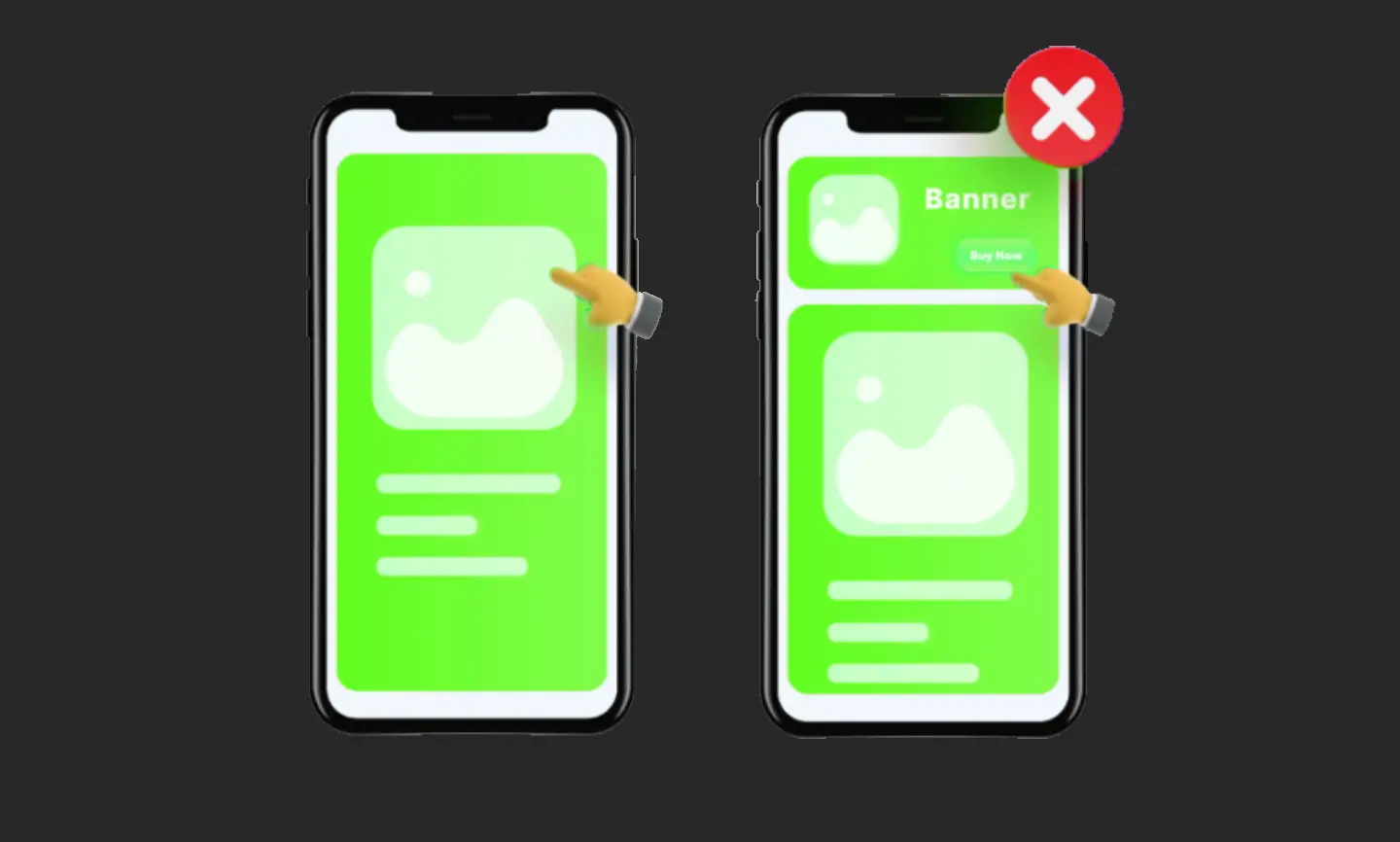
I’m sure you’ve had the frustrating experience of trying to click on an ad’s x, only to have the layout shift cause it to shift and you end up clicking on the ad instead of the x on the ad, and that’s exactly what happens here.
It will be easier to understand if you actually look at the demo page below. (It may be difficult to understand unless you view it on a PC.)
On the demo page, the image on the left has its width and height specified, while the image on the right has no dimensions specified.
It may be a little difficult to understand, but if you open it in Chrome or similar and click Ctrl+F5 or similar to refresh, you will see that the image on the right is displayed at the top for a moment because there is no image margin set when the page loads, and then is displayed in the correct position after the image has loaded.
This is the phenomenon known as layout shift
. If the size is not specified properly, the page may move unexpectedly, such as shifting slightly, when displayed in a browser.
Especially with buttons or links of any kind, you need to be careful as they may shift out of place the moment you try to click them, which can irritate the user.
If you enter the size, the space will be reserved in advance.
As mentioned above, by specifying the imgtag , the browser will add a margin of that size before the image is even loaded.widthheight
It reserves a margin of that size, as shown on the left side of the demo page, so the content loaded after the image will be displayed in the correct position without any stuttering or misalignment, as shown in the image on the right.
This may not have much of an impact on normal websites, but for sites or pages that use a lot of images, such as mail-order sites or landing pages, this can cause a lot of activity after the page loads, which could lead to users abandoning the page.
What to do if you want to make it responsive
When we write about setting the size, you might be wondering, “It’s fine for PC sites because they’re a fixed size, but what about pages for tablets or smartphones, or sites that are responsive?” Don’t worry.
Ultimately, the design will be handled using CSS, so it’s likely that you’ll specify the width as 100% on a smartphone and the height as a relative size to that, so this isn’t a problem.
width="1000"Even if this is written in the HTML, width: 100%;if the setting is made in CSS, it will naturally fit within the size of the parent element and the design will not be affected, so there is no problem if you continue as usual.
What you actually need is the image ratio, not the actual size
When setting up to prevent layout shift, the image ratio is important, so imgas long as you write the correct height and width ratio, there will be no problem.
widthheightWhen specifying attributes such as , the actual appearance and size are often set using CSS width: 100%;such as and , and if the size is correct, it should appear correctly reflected by the CSS settings.max-width: 100%;
Therefore, strictly speaking, the important thing with the HTML img tag widthis heightto make sure that the aspect ratio of the image is correct, but rather than having to enter the ratio every time, it would be fine to just enter the actual size as is.
Recently, with this layout shift bringing a lot of excitement to SEO-related topics, people often explain that you should include ‘ widthand height‘, but even so, it’s still possible to code it provisionally and then forget about it, so it’s important to get into the habit of including it properly.
Summary
Recently, this layout shift has been much talked about in the Core Web Vitals proposed by Google, so it has become a trend to require writing the and , but since they will still be displayed visually widtheven heightif you don’t write them, there are still a few people who don’t write them.
When you take over site production midway or look at a site after replacing update management, you may find that many sites have not been specified, so be sure to remember to write it down.
The important thing to consider when writing sizes is actually the aspect ratio, but ultimately it’s safest to just enter the image size as is and then use CSS to adjust the appearance, as this is the smoothest and least distracting way to do it.
Also, when actually coding, altbe sure to not only specify the vertical and horizontal sizes, but also remember to include other details such as:
Ifwidth you’re going to make a website , isn’t it a good idea to make sure that all three elements are included by default? Personally, I think so, and I actually do that. (I would also like to say that the loading and decoding attributes should also be the defaults, but I’ll write about that in another article.)heightalt