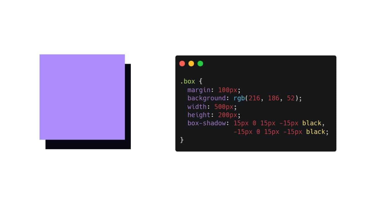
In the past, if you wanted to add a shadow or something, you had to process it with an image, but nowadays, a lot of things can be done with just CSS. The theme of this article is box-shadowone of those things, and it’s something that’s used quite often in practice.
As you can easily imagine from its name, box-shadow is a property that allows you to add shadows to box elements and images.
It’s not a particularly difficult property to use, but if you haven’t had a chance to use it for a while, you might find yourself wondering…
What order was it in? And you might have questions about how it’s actually used in production, so I’d like to explain it in this article taking that into consideration.
I would like to start by reviewing the basics, and then write about some common ways in which it is actually used, although I won’t go as far as to provide examples.
How to add a shadow to an element using box-shadow
box-shadowAs mentioned earlier, is a property that allows you to add a drop shadow to box elements, images, etc. Below is an image of what it looks like when actually used.
In actual writing, there are six setting items, which are used as follows when writing:
box-shadow: x-position, y-position, blur distance, shadow size, shadow color, inner;This is a little confusing, so if you actually write it out, it will look like this:
box-shadow: 10px 10px 5px 0px #ddd;This will set the:
- X axis to 10px
- Y axis to 10px,
- Blur radius to 5px
- Spread radius to 0px
- color to light gray
The first sample was created with these settings.
If you specify inner using inset, you can make the shadow appear on the inside instead of the outside, as in the sample below. However, I don’t think there are many opportunities to use this in practice, and it’s probably limited to certain cases.
box-shadow: 10px 10px 5px 0px #ddd inset;Let’s take a look next at what happens when you change each of the values.
1. Specifying the width in the X and Y direction
So the first setting in box-shadow is the X axis = horizontal shadow position and size, and the second setting is the Y axis = vertical shadow position and size.
The shadow will be cast from the point moved by the set number of pixels. Also, out of all six items, the vertical and horizontal axis settings are required.
To make it a little easier to understand, in the sample below we have used larger values of 20px in both the height and width.
box-shadow: 20px 20px 0px 0px #ddd;
A shadow of 20px is cast from the point that is actually 20px away. You can also enter negative values for the vertical and horizontal dimensions as shown below.
box-shadow: -10px -10px 0px 0px #ddd;If you enter a positive number, the shadow will extend to the bottom right, and if you enter a negative number, the shadow will extend to the top left.
In actual work sites, for example, when the same layout, such as five points or features, is repeated above and below, changing the direction of the shadow can be used to add contrast.
2. Setting the shadow blur distance
The third setting is the blurriness of the shadow. Like the X and Y values, you can specify this in pixels to change how blurry the shadow will be.
The larger the value here, the more blurred the shadow will be, and omitting it is treated as if it were set to 0px. If you specify 0px, as in the sample above, the shadow will be unblurred.
box-shadow: 10px 10px 0px 0px #ddd;
If you set this to 10px, it will create a blurry shadow.
box-shadow: 10px 10px 10px 0px #ddd;
3. Adjust the shadow size
The fourth setting is the shadow size. This can be a little tricky, or it can turn out differently than you think, so you need to be careful.
You can adjust the size of the shadow by entering a value in px here, but the shadow will spread in all directions by the amount of px you enter. It may be hard to understand from just the text, so it may be easier to understand if you compare different values side by side.
For example, if you compare the values below, specifying 0px with those specifying 10px, you can see that when you specify 5px, the shadow extends 10px in all directions (up, down, left, and right).
box-shadow: 10px 10px 0px 10px #ddd;
box-shadow: 10px 10px 0px 10px #ddd;
box-shadow: 10px 10px 0px 10px #ddd;
By specifying the vertical and horizontal position as 10px and the shadow size as 10px, the shadow will extend 20px to the right and bottom.
You may be wondering if there is any use for this box-shadow setting, but the size and starting point of the shadow are determined by the first and second vertical and horizontal values.
Therefore, if you specify 5px 5px, the shadow will be 5px wide at a position of 5px, and you will not be able to set a smaller shadow size but display the shadow at a slightly distant position.
In such cases, you can make good use of the shadow size adjustment.
This is very simple. You can also specify negative values for the shadow size, so by entering larger numbers for the vertical and horizontal sizes and a negative number for the shadow size, you will be able to set up a shadow like the one below.
box-shadow: 15px 15px 0px -7px #ddd;
By doing this, a 15px shadow will be displayed at 15px and 15px, but because the shadow size adjustment is set to -7px, the shadow itself will actually be displayed at 22px and 22px, with a size of 8px.
4. Shadow color setting
Next, let’s talk about the shadow color. I think this is self-explanatory, but you can just specify the color code.
It is possible to omit it, but if you do not specify it, the color of the element will be automatically reflected. Sometimes on other sites, it is written that it will be black, but that is just because the color of the box element is black, and it does not necessarily mean that it will be black.
For example, if you specify a purple color for the element as shown below, and omit the shadow color, the same purple as the text color will automatically be reflected.
color: #ab66d9;
box-shadow: 10px 10px 0px 0px;You can also specify the color code using rgba.
box-shadow: 10px 10px 0px 0px rgba(171, 102, 217, 1);
5. Specify the shadow to be inside instead of outside
Finally, it is about specifying the position of the shadow, or whether it is outside or inside.
If you add inset, the shadow will be placed inside the box, and if you omit it, it will be placed outside as usual.
box-shadow: 10px 10px 0px 0px #ddd inset;You might not know how to use this alone, but if you apply a balanced shadow to the whole image, you can create a design like the one below.
box-shadow: 0px 0px 10px 5px #ddd inset;In the sample above, border-radiuswe have set the shadow and made the background a little lighter than the shadow, but it is also possible to use an inward shadow in this way.
How to set multiple shadows
In fact, with box-shadow you can set multiple shadows.
By separating them with a comma , you can specify multiple shadows in the same box, and you can specify two or three shadows at a time.
Below is a sample of three shadows. (I added strange colors to make it easier to understand.)
box-shadow: 7px 7px 5px 0px #ddd, 10px 10px 5px 0px #ff0000, 15px 15px 5px 0px #000;
You can see that the shadow is #ddd first, then the red shadow, and finally the black shadow. Of course, you can also use inset to specify both an inner and outer shadow.
Considerations on using box-shadow
box-shadow it’s very convenient, but there are a few things to be aware of when using it. It’s not a critical issue, but if you don’t know about it, you might be confused, so be sure to keep it in mind.
1. It cannot be used with transparent images or pseudo elements (it will not work as intended)
Actually, it is important to note that if you use it on an image, it will not work as intended if you use it on a transparent image. Similarly, if you use it on a pseudo element, it will not cast the intended shadow.
When trying to add a shadow using box-shadow to a transparent image or pseudo-elements , you might imagine the shadow being applied to the edges of the image itself (which has no background), or the shadow being applied taking the pseudo-elements into consideration, but unfortunately the shadow is applied to the frame of the entire image, and the pseudo-elements are ignored.
Therefore, if you want to add a shadow to transparent images or pseudo-elements, you will need to use filter: drop-shadow().
Pay attention to margins
Another thing to be careful of is margins. When you use box-shadow, to put it simply, a shadow is added after the fact.
For example, if you give a shadow of 10px to a box with a margin of 10px, as shown below, the margin will become zero.
The margin is only given to the box, and the shadow is added to that box, so be careful when applying a large size as the margins may end up being more packed than you expected.
Examples and solutions when the settings do not work
This won’t happen if you’re coding by yourself, but if you take over in the middle of something, you box-shadowmay encounter situations where the settings you’ve set aren’t working, depending on how you use it.
In such cases, it is usually the case that you should try the following:
When adjacent elements have backgrounds
This is related to the point above about paying attention to margins, but box-shadowthis applies when an adjacent element has a background set; if there is no margin, the element will be hidden under the background, as shown below.
A common case is when you try to add a shadow to a fixed header, but it doesn’t appear! (You can see in the sample below that the shadow at the bottom does not appear.)
This does not mean that the shadow is not actually displayed, but that it is displayed under the background of the adjacent element. Therefore, by adding it position: relative; to the element where you set the box-shadow , you can display the shadow properly .
However, even if you set it this way, it will still be displayed overlapping with adjacent elements, so it’s fine if that’s the case for layouts such as headers, but if not, marginmake sure to leave proper margins.
Overflow: hidden; in a parent element and it exceeds the width
This is also quite limited, but cases like this can sometimes take longer to resolve.
This is somewhat related to margins, etc., but border-boxif the parent element of an element with a set width has a set width and is displayed at 100% of that size, and if the parent element also has a overflow: hidden;set shadow, the shadow will not be displayed.
This is also a phenomenon where although the element is actually displayed, it exceeds the width of the parent element and is therefore hidden, making it invisible.
In this case overflow: hidden;, you would probably have to deal with the problem by removing the parent element or reducing the width of the child element.
If you remove it from the parent element, overflow: hidden;it will be displayed exceeding the width of the parent element as shown below.
shadows too
Below, the child elements are slightly sized to fit within the parent element.
Various examples using box-shadow
Finally, I would like to end by introducing some actual examples of how to use box-shadow.
The samples above are extreme examples for easy understanding, so in reality they are not used exactly as they are. I hope that you will take a look at the samples below and get a sense of how they are actually used.
I’d like to post the actual CSS and a sample of each.
Writing CSS for all boxes would be too long, so since all the CSS except for box-shadow are common, I set it as shown below.
<div class="sample-box">Sample Box<div>.sample-box{
display: flex;
align-items: center;
justify-content: center;
width: 300px;
height: 100px;
margin: 30px 0px 0px;
color: #999;
border-radius: 3px;
background: #eee;
}General usage of shadows
This is probably the most common use, adding a shadow to the bottom right.
When I use it, I usually blur the shadow and use it like a drop shadow.
box-shadow: 7px 7px 10px 0px #999;
How to add a blurred border to the whole image
This is also often used, but it is used to add a blurred frame to the whole image. It is
often used for images, and is often added when the mouse hovers over the image on a PC.
box-shadow: 0px 0px 15px 0px #ccc;
Use an inner shadow
This is the same as the previous sample, but this pattern uses an inward shadow.
box-shadow: 0px 0px 15px 5px #ddd inset;
Use it to look like a slightly swollen button
box-shadowYou can specify multiple buttons, so by using them effectively you can make the button look slightly bulging. You can use it as an accent on buttons.
box-shadow: 0px 0px 3px 0px #ccc, 0px -3px 5px -3px #777 inset;
Use the shadow without blurring it and display it from a little distance.
When actually adding a shadow, it is often used in a blurred manner like a drop shadow, but it is also common to use it without blurring it at all, placing it a little distance away.
I often assign a theme color to the overall frame of an image or layout.
box-shadow: 20px 20px 0px -10px #999;However, if you use a negative value to adjust the shadow size, as in this example, border-radiusthe effect will disappear by the amount of the negative value, so be careful. If you specify -10px as in this example, and border-radiusit is less than 10px, the curve of the shadow border will disappear.
For example, if you do not specify a negative value as shown below, the shadow will be added while the curvature of the border will remain the same. (A border-radiuslarge value is given to for ease of understanding.)
border-radius: 10px;
box-shadow: 10px 10px 0px 0px #999;However, as you can see, it will no longer be possible to display the image at a distance.
Although this is a minor detail, it can change in many ways depending on how you use it, so be careful.
Use multiple settings to create a neon-like effect with different colors
I don’t have many opportunities to use it, but I have occasionally used it as an accent for a slightly flashy website, so I’d like to introduce it to you.
box-shadow: -5px -5px 10px 5px #fea0c6, 5px 5px 10px 5px #f0707e;
This makes it possible to create a neon look by changing the colors.
Specify multiple colors to create rough gradations
This too may only be used in limited situations, but you may find yourself using it in places where you want to make something stand out.
box-shadow: 5px 5px 0px 0px #444, 10px 10px 0px 0px #777, 15px 15px 0px 0px #aaa, 20px 20px 0px 0px #ddd;
Summary
box-shadowIt may be used simply to add a small shadow, but it is actually a property that has a surprisingly wide range of uses.
If you use this effectively, you can decorate more than you think using just HTML and CSS, and it can also make it easier to add variety when the same layout is used repeatedly.
I actually use it a lot myself, and I use it a lot on the pages of this site.
Depending on how you use it, you can create a variety of different ways to display it, so be sure to master it and make use of it.